First & Fourth Stationary Co.
Folksy yet modern branding for a start-up planner insert design company
Folksy yet modern branding for a start-up planner insert design company
BRANDING, LOGO DESIGN
Objective
Design a logotype and logomark for First & Fourth, a planner design company focused on creating modern and efficient planner inserts with a folksy and organic feel.
Process
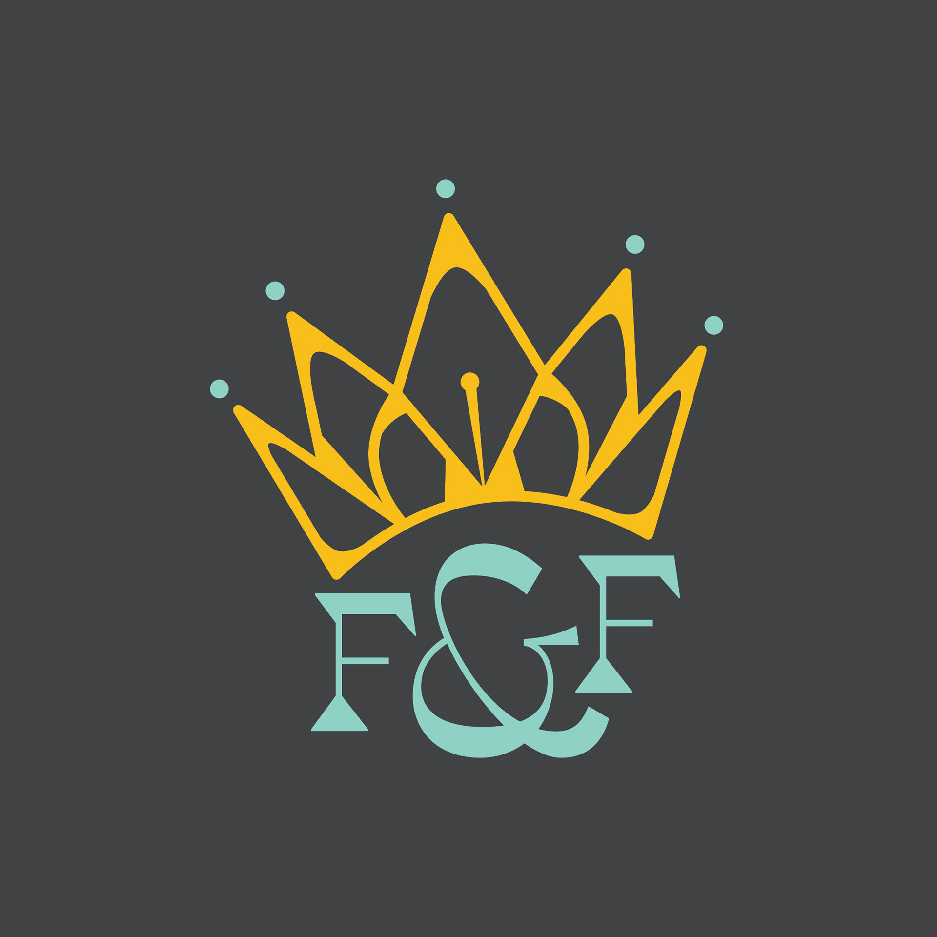
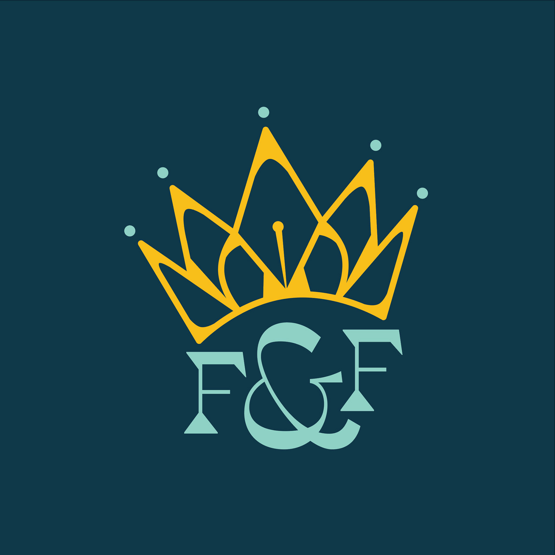
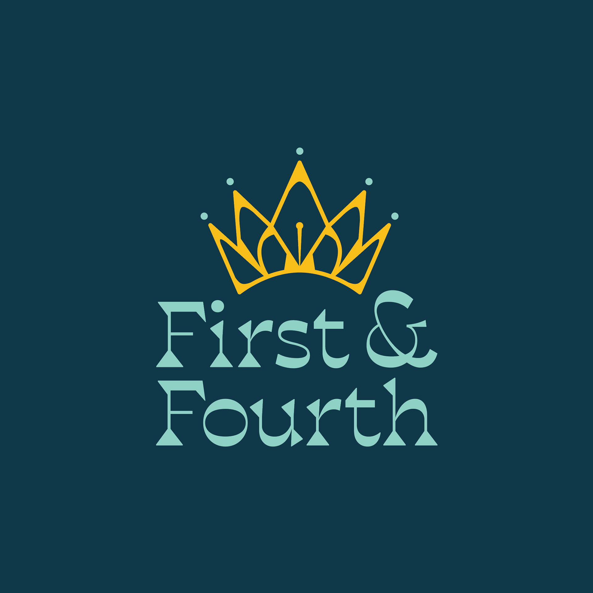
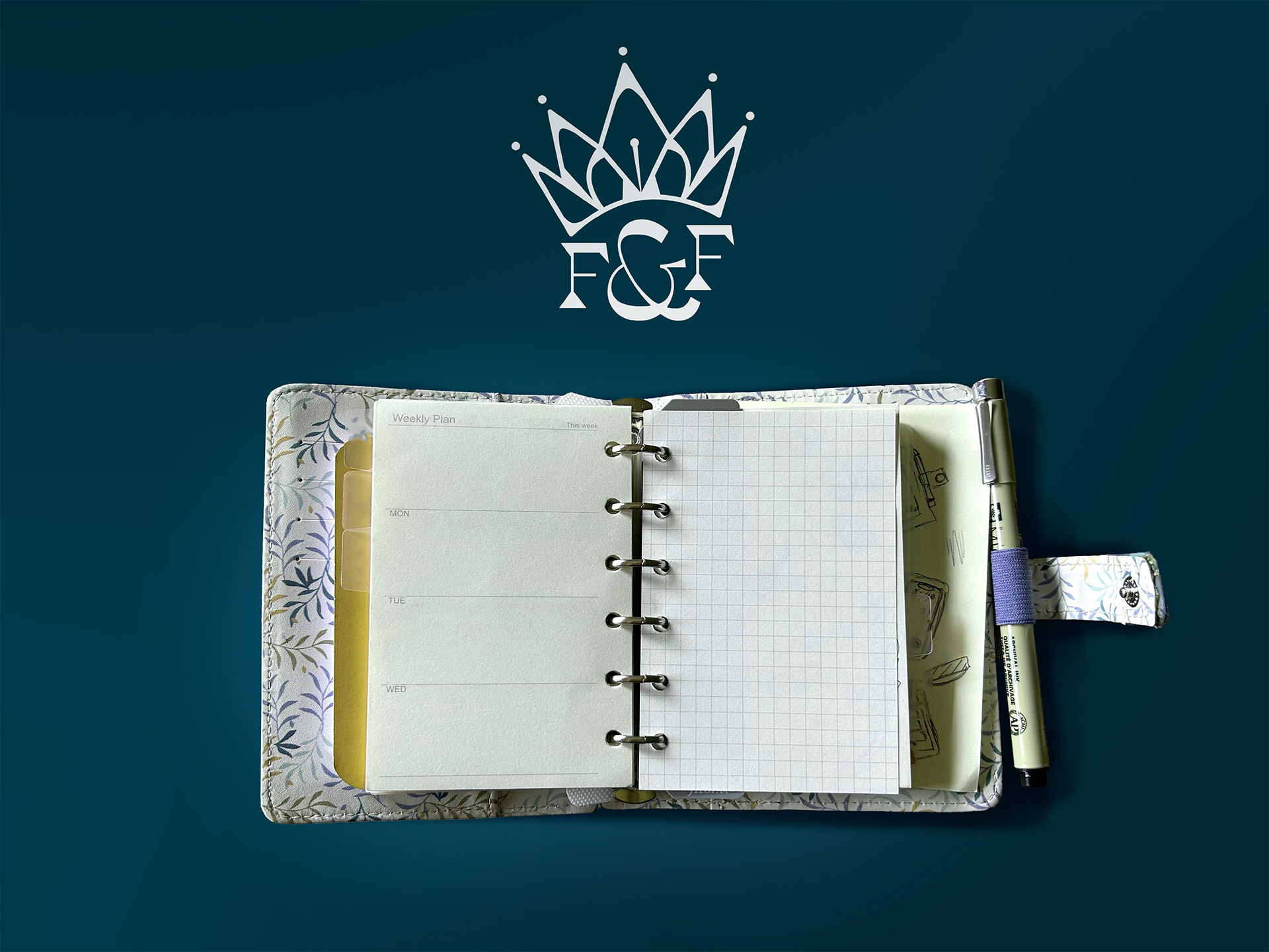
First & Fourth is a company started by a mother and daughter, and the name was chosen to reflect their birth orders; the mother was the fourth child in her family, and the daughter is her firstborn. As Christians, they consider themselves “daughters of the King” and wanted to convey this identity in their branding through a ‘royal’ feel.
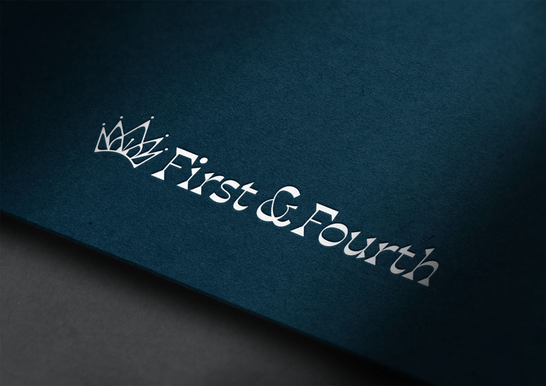
In creating this logo, I wanted to combine the folksy feel of the illustrator’s style with the sleek planner designs they wanted to do. I decided to make the logo a princess’ crown combined with an ink-dip pen to convey their Christian identity and stationary products.
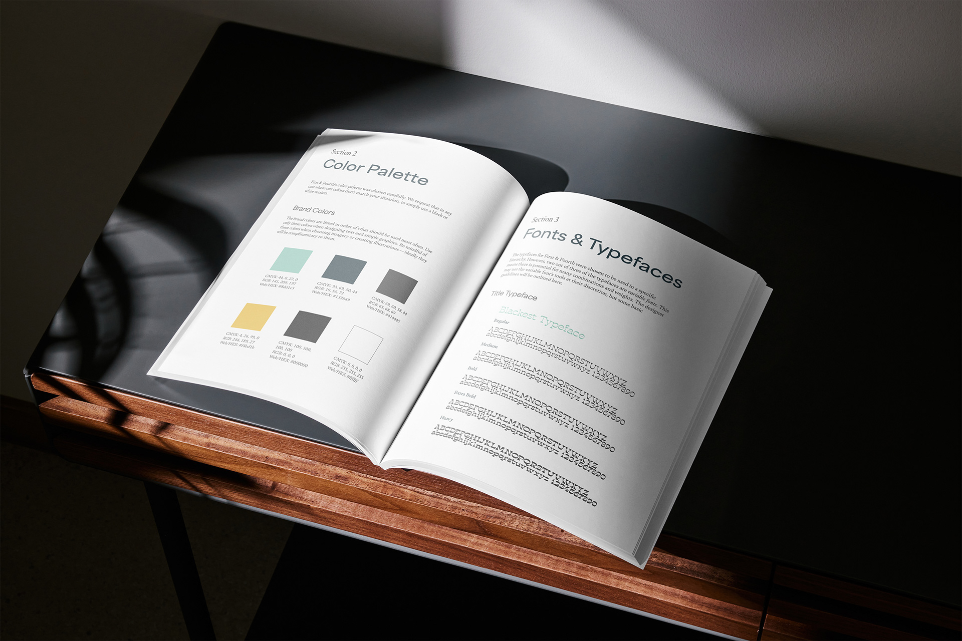
Considering the early-stage nature of the company, I decided that they might benefit from a style guide as well, even though they hadn't requested one. It was a simple but well designed booklet, that made the logo and branding usable for any future employee. The owner truly appreciated this, and decided to keep me on retainer for further consultation.