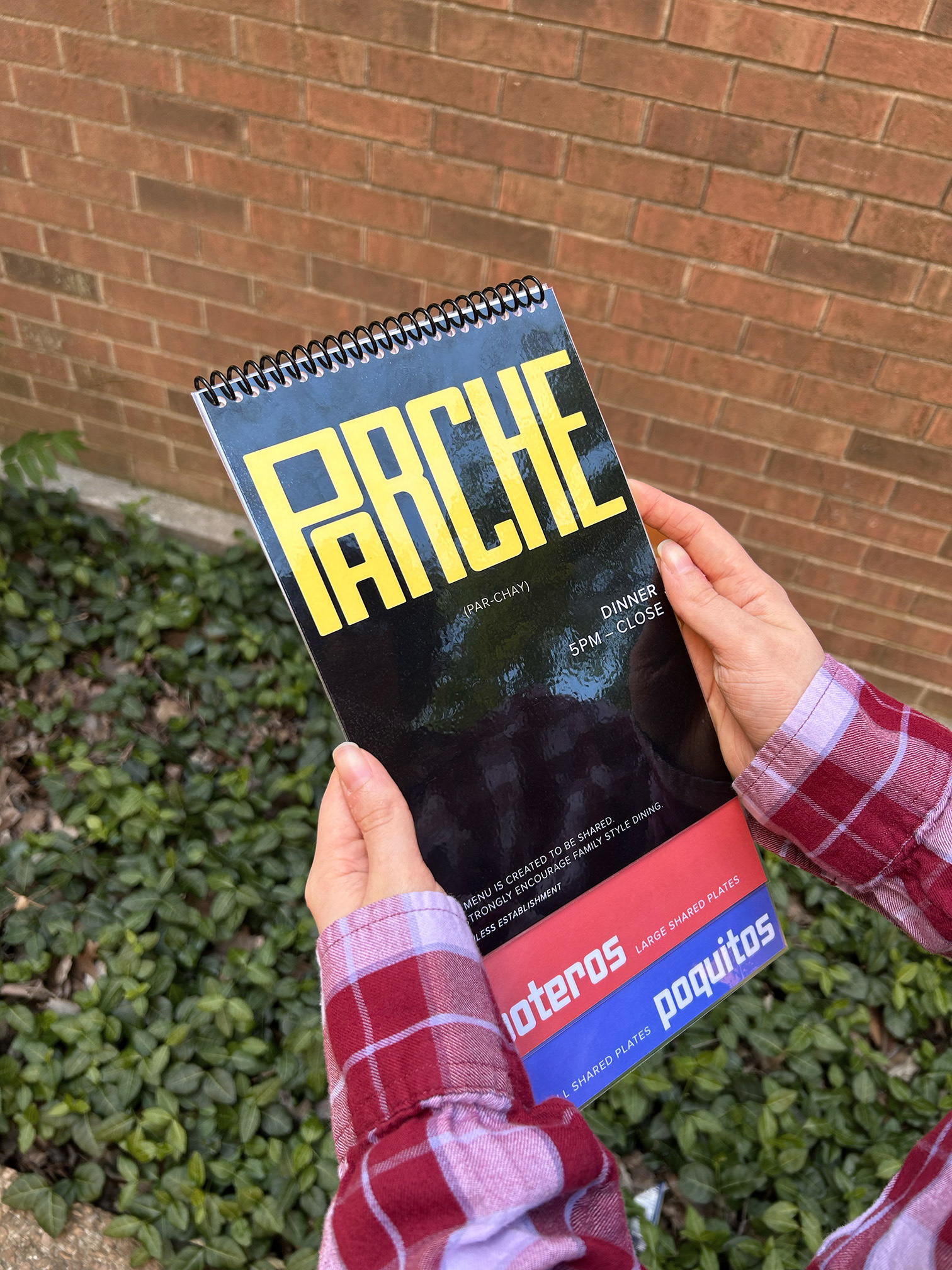
Parche Menu Redesign
A re-imagination of the contemporary Columbian restaurant’s dinner menu
PRINT DESIGN, ILLUSTRATION
Objective
Redesign Parche’s dinner menu to better match the overall aesthetic of the restaurant convey their high quality cuisine.
Process
The word parche (par-chay) is a Columbian slang term used to refer to a ‘hangout;’ and the contemporary Columbian restaurant takes this casual and fun word and combines it with excellent cuisine and atmosphere to create the brand and vibe that is Parche.
Parche already has great graphic design all around — their interior is inviting yet high-tier, their logo is gorgeous, and they have great murals and illustrations. The only thing that doesn’t seem to match is, surprisingly — their menus.
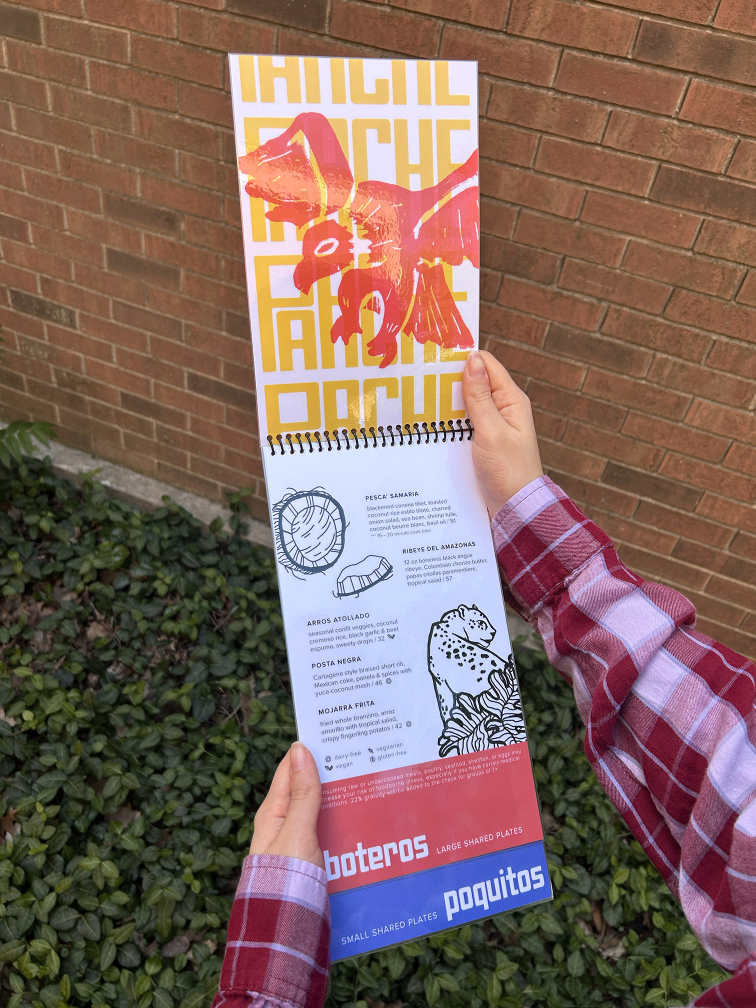
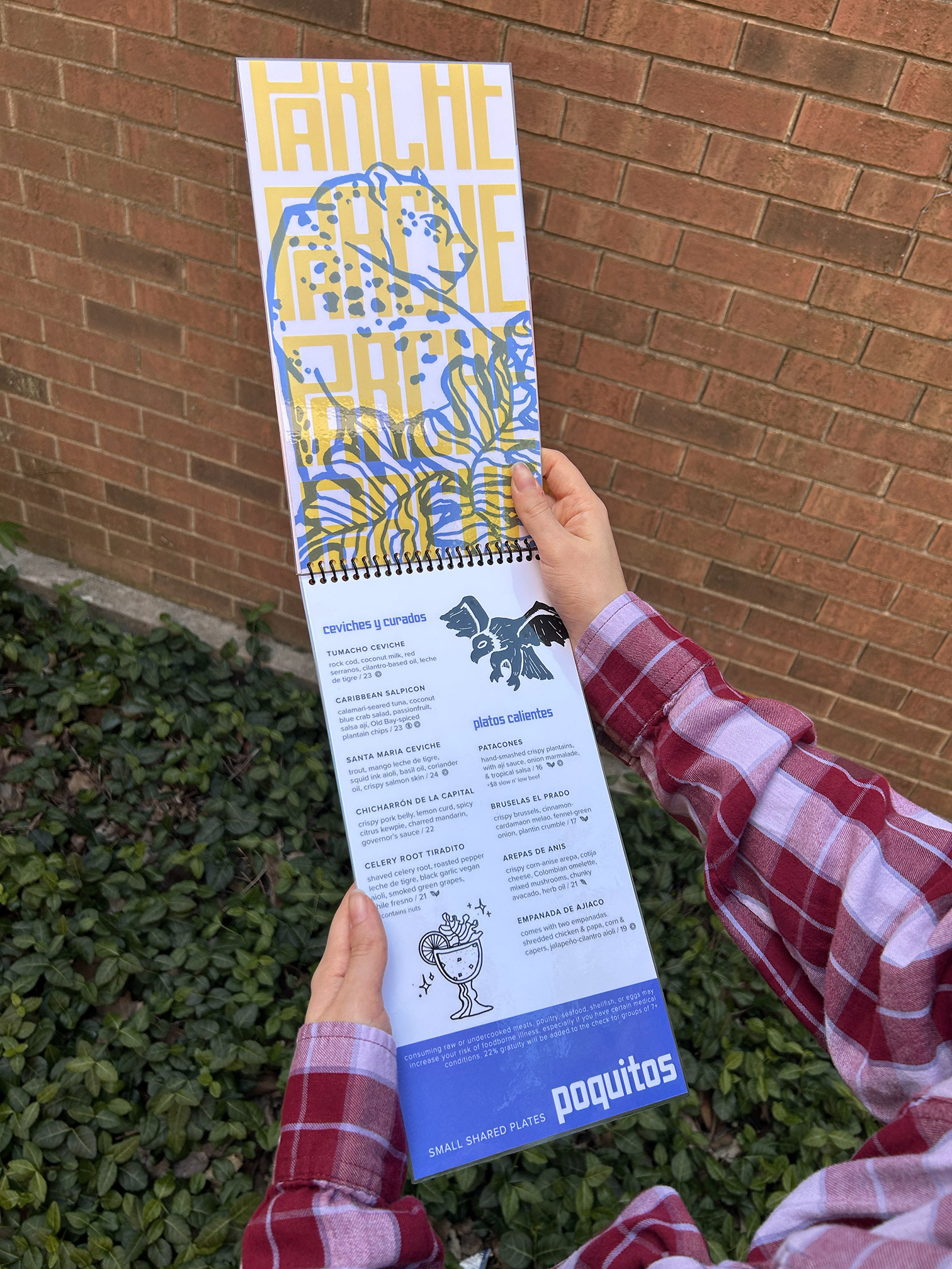
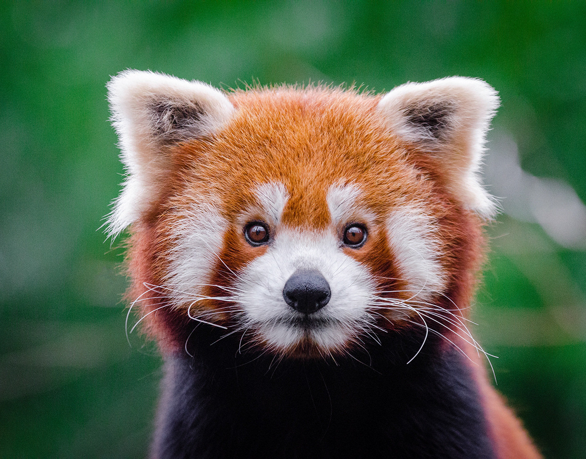
Taking a closer look at their dinner menu specifically, I noticed that they were trying to incorporate their mural mascots — a jaguar and their national animal, the Andean condor — into the menu. This and their decent typefaces choices gave me a great springboard to make the menu live up to the curated image they put forth in their atmosphere and branding.
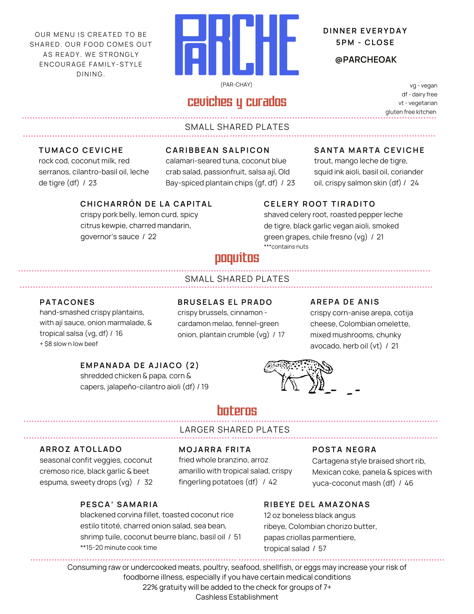
I split up the sections laid out on the original into pages, and then created new illustrations that better reflected the quality of the ones on the walls of the restaurant. The final product is an engaging and cohesive menu that keeps the excitement going while
ordering your food.
ordering your food.
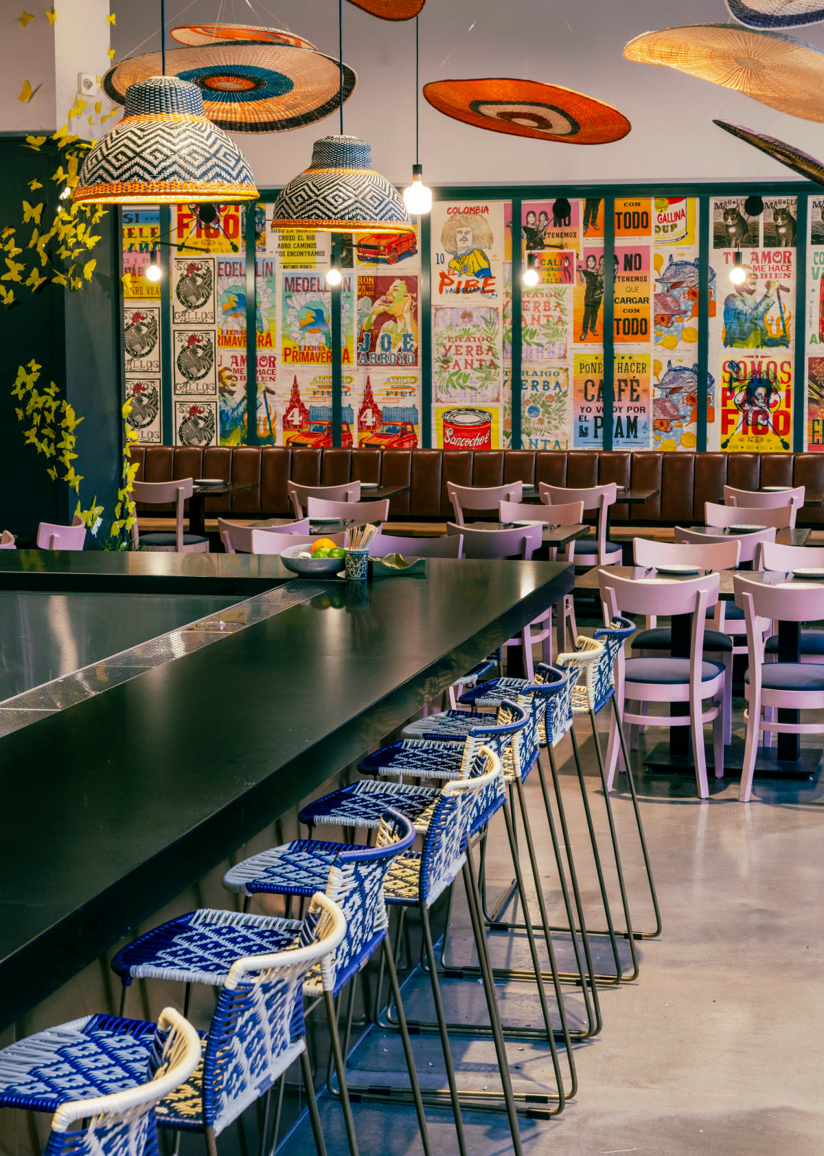
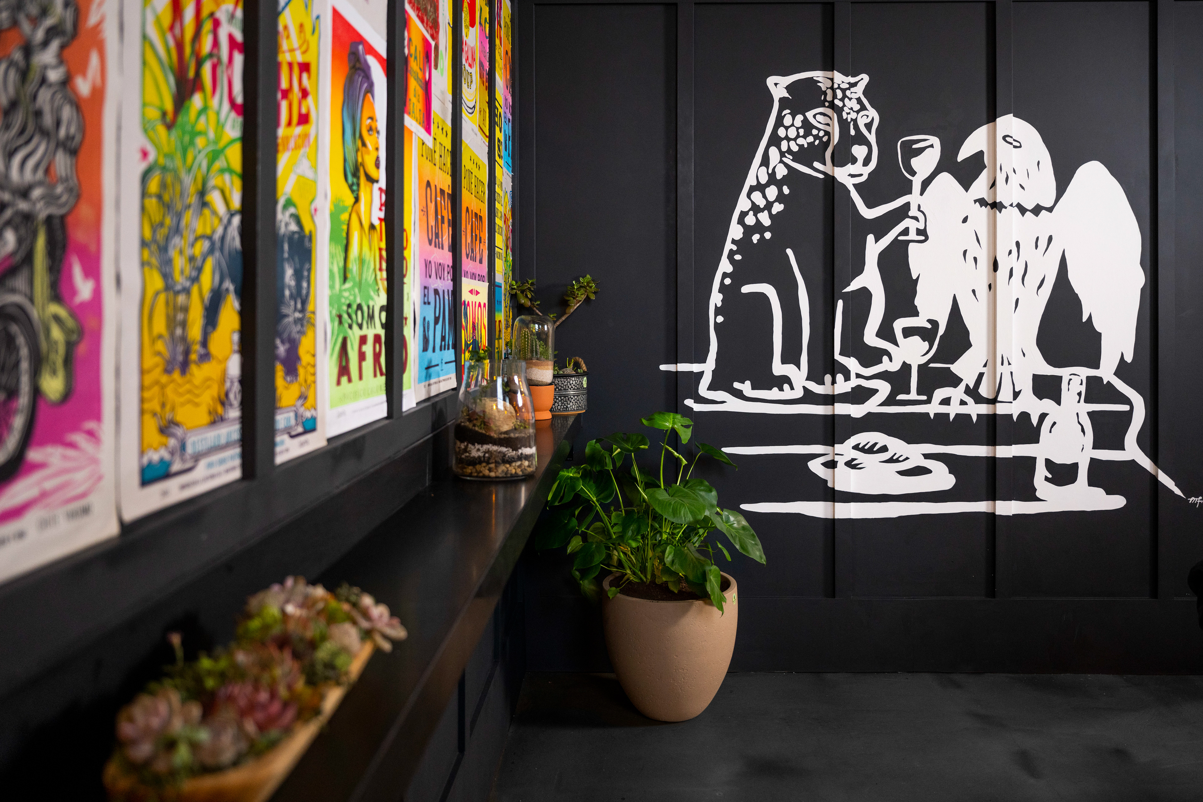
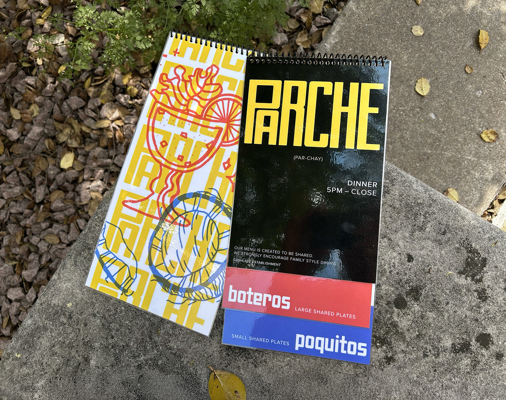
Old menu compared with their environment and murals of the mascots.
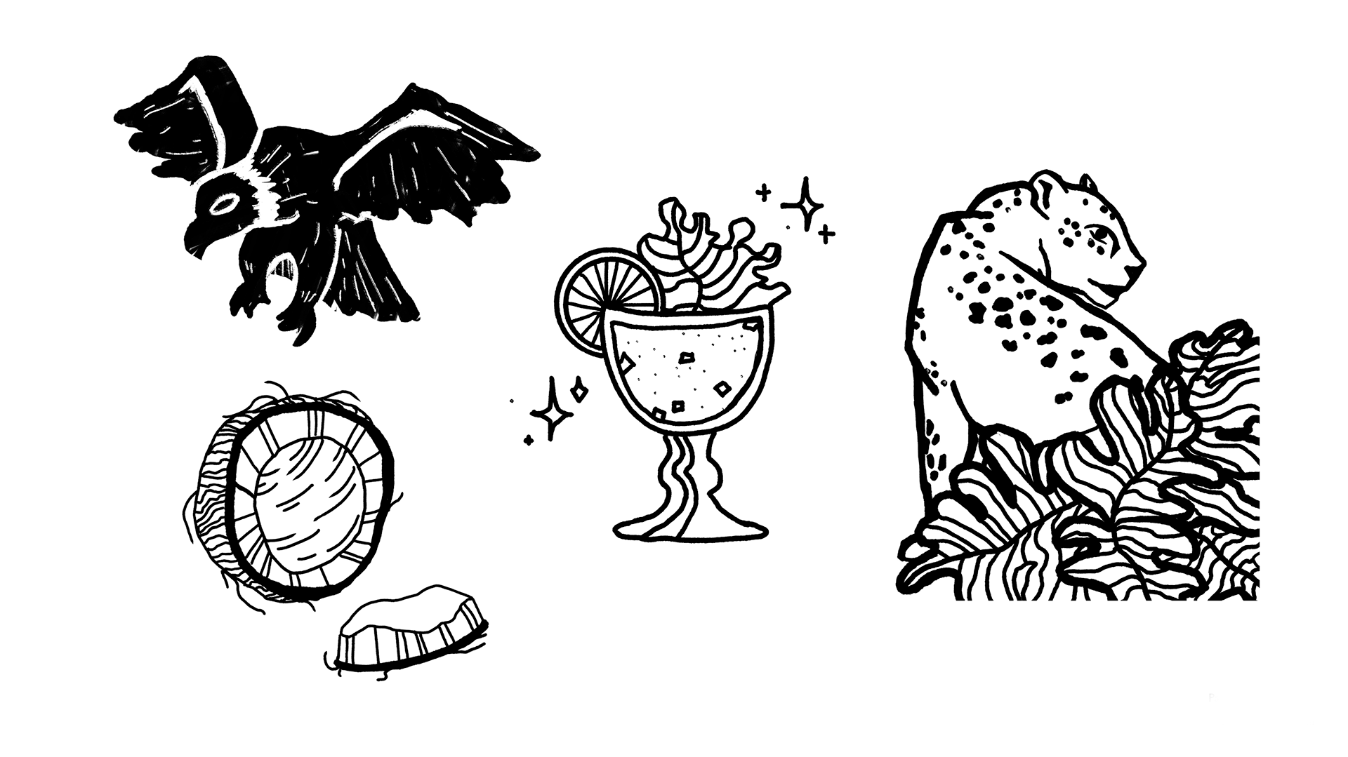
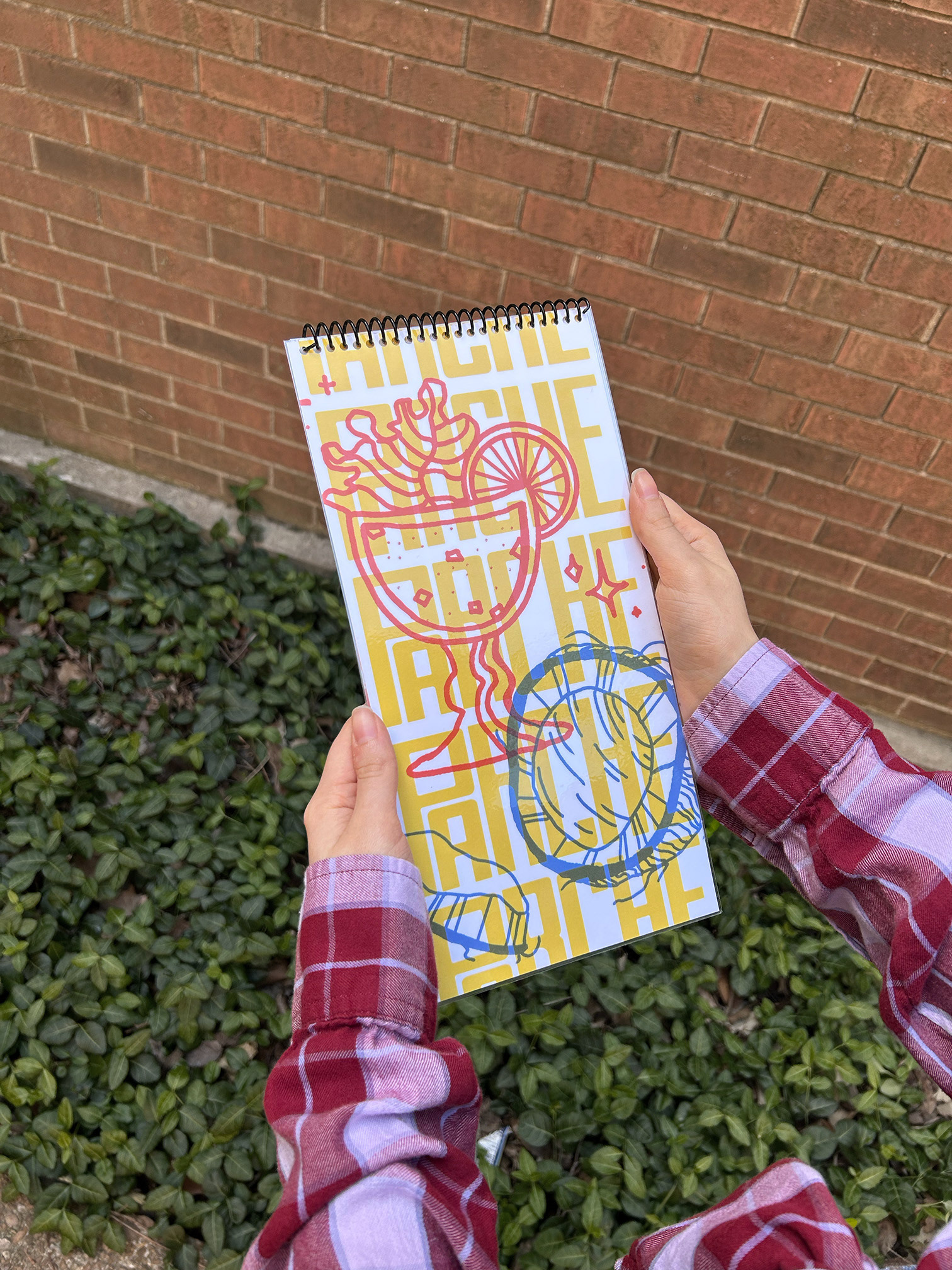
New illustrations I made for the menu, matching the existing style and mascots. Drawn in Adobe Fresco.